This mountainside apartment gets a makeover in fifty shades of grey
A 2,800 square foot apartment halfway up The Peak gets a makeover in fifty shades of grey

Unless you’re a die-hard bachelor, dark colours wouldn’t be the first prescription you would give your interior designer when renovating your home. Most want light, bright and airy – the aesthetic ruling today’s concept of ‘clean’ design.
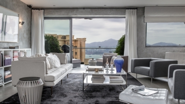
Step into this minimalist trove in Mid-levels, however, and you might change your mind. Black metal was used to clad doors, stairs and cabinets. The living room carpet – sourced from Pakistan – was dyed in Hong Kong by the designer herself in shadowy casts.
“I like to use these inky colours,” says Parisian interior designer Peggy Bels, who has been reviving properties in Hong Kong, Thailand and Bali since 2008. “Dark backgrounds allow light colours to pop and create more contrast and deepness. Rough textures also give character to a space.”
Despite Bels’ penchant for deep hues, the apartment maintains its luminosity and spacious atmosphere thanks to the “warm grey” palette – Bels’ signature colour scheme – and her use of strong brights. Graphic elements like splashes of red add dimension, mostly found in the curated artwork decorating the ‘milky’ walls.

“I mix water into the cement finish to get that effect,” says Bels. “When you do that, you get a milky colour that feels cosy and warm.” She also balances out the dark wood (see: dining table) with soft fabrics and white marble (see: kitchen counter) continuing her contemporary theme of minimalist contraposition.
In 2014, a French couple approached Bels to renovate their 2,800 square foot flat in Mid-levels. They were looking for a modern restoration, and asked Bels to free up the living and dining areas.
Before Bels came in to do her magic, the flat had already been partially renovated 10 years ago. The partitioned layout and Chinese flooring remained, however, and that had to go. The French designer converted the flooring with grey oak, and removed the walls between the kitchen and living spaces.

Getting in her way, however, were structural beams between the entrance, living room and kitchen. “We had to keep them there, but I covered them with the same cement finish to make them interesting,” she says. “The effect is seamlessness, that’s the key to keeping that open sensation.”
This is Bels’ favourite part of the flat: the flowing space of kitchen, dining and living area is without a doubt the house’s standout feature spilling out to a 400 sq ft open-air balcony. The lofty view of sea and mountain makes you feel like you’re on top of Hong Kong.
Private quarters: Plush sanctuaries with leafy views
Departing from the communal zone, we walk through a narrow hallway to seek the private quarters. Round mirrors combat the cramped effect, as do large rectangular frames of varying themes; there’s not one inch here that’s over or under decorated.

Light pours into the master bedroom, a plush sanctuary with leafy views. A map of Paris’ metro hangs over the couples’ headboard – or used to, as it is not known if the flat’s new inhabitants have kept it there. Over a year ago, the house went up for sale.
We’re sure, however, that the floor-to-ceiling closets of the intimate quarters’ dressing room have been kept. The wardrobes, which line both sides of the lavishly carpeted space, would certainly not be out of place in the world of Carrie Bradshaw.
Bels’ six-month-long renovation finished in May 2015. Her original included a nursery for the French couples’ daughter; a chic princess’s kingdom that somehow fits in with the rest of the décor despite its pink pastels and quirky rocking sheep.

This tour finishes with the TV room-cum-study across the way, furnished with a stingray leather writing desk and vintage leather loveseat. The mounted flat screen is camouflaged among the charming assortment of picture frames hung all over the white-painted wall: an oval portrait here, an overexposed Eiffel Tower there.
Subtlety and simplicity
While Bels’ approach is far from the earthy and warm tones that others utilise to create a homey glow, hers is a cooler comfort that relies on subtlety and simplicity. Her idea of home is completely free of clutter, making use of texture and light instead to round the edges.

If you like what you see, then you might find her advice useful: “Let light circulate; use a combination of floor lamps, table lamps, and down lights from a false ceiling. Use a directional recessed spotlight to bounce reflected light off walls, in order to open out the space.
“Put all these lights on dimmer switches to allow for flexibility, depending on the time of day, event, or mood. Lighting fixtures are essential in adding character; don’t overfill the space with too many furniture and accessories.”
Bels’ homes, seemingly designed as if from a Coco Chanel collection, also happen to reflect her countrywoman’s philosophy: “Luxury must be comfortable, otherwise it is not luxury.”
Words: Julienne C. Raboca


