Modern Marvel: Amidst the towering skyscrapers of Hong Kong, this stunning home redefines the pinnacle of urban living
High population density, limited landmass, a superfluity of the mega-affluent – you don’t need to be too much of a genius to understand why Hong Kong real estate commands such a seemingly unreal valuation. Even with property prices tipped to rise by an additional 10 percent this year, buyers remain wholly undeterred, with the residential purchasing cycle seemingly set only to accelerate.
Purchasing property and creating a home, of course, represent very different challenges. While the former requires a mastery of certain legal and financial necessities (or the tactical deployment of someone who does), the latter requires you to give a part of yourself, as you set about transforming a developer’s shell into something perfectly tailored to your family’s values and expectations.
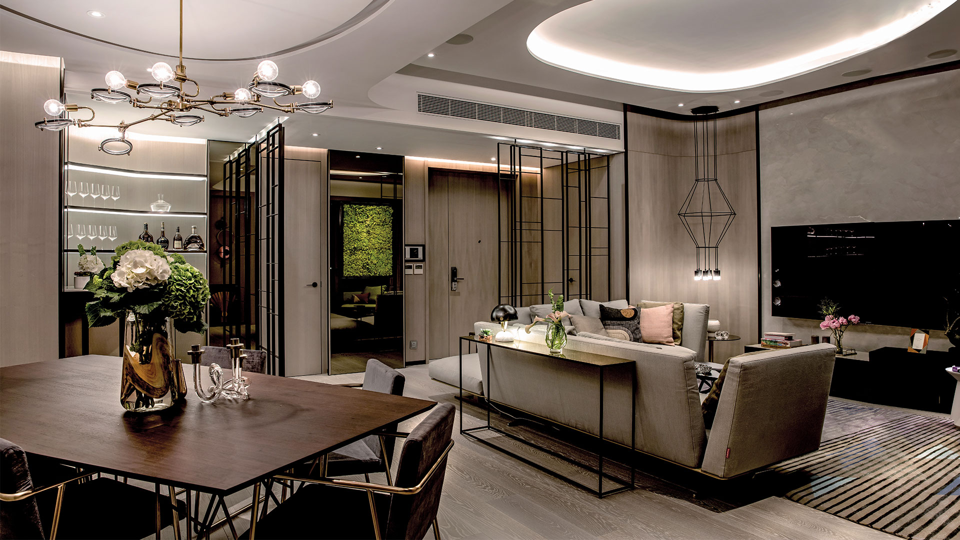
It was just such a challenge that faced a young mainland family of four as they sought to reinvent the 2,300sq.ft space they had bought in Tsim Sha Tsui’s high-end Grand Austin development. While their newly-completed apartment came with all the expected fixtures and fittings, it was somewhat lacking in any of the individual touches and flourishes that would mark it out as a true family home. That’s when they decided to call on the services of a professional – a professional who so successfully re-fashioned their home that it was declared the Best Apartment in the 2017 Asia-Pacific Property Awards.
Their chosen professional was Johnny Leung, Creative Director of Chinc’s Workshop, a Sheung Wan-based, award-winning interior design consultancy. Recalling the initial brief, Leung says: “The family was very clear as to what they wanted – a practical, contemporary home, with strong visual appeal and a clear bespoke functionality in each of its separate spaces.”
Their chosen professional was Johnny Leung, Creative Director of Chinc’s Workshop, a Sheung Wan-based, award-winning interior design consultancy. Recalling the initial brief, Leung says: “The family was very clear as to what they wanted – a practical, contemporary home, with strong visual appeal and a clear bespoke functionality in each of its separate spaces.”
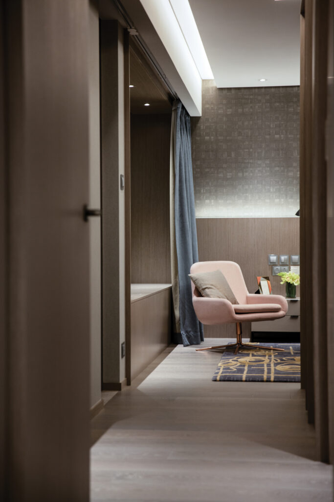
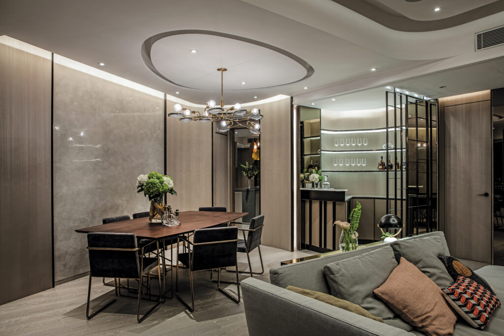
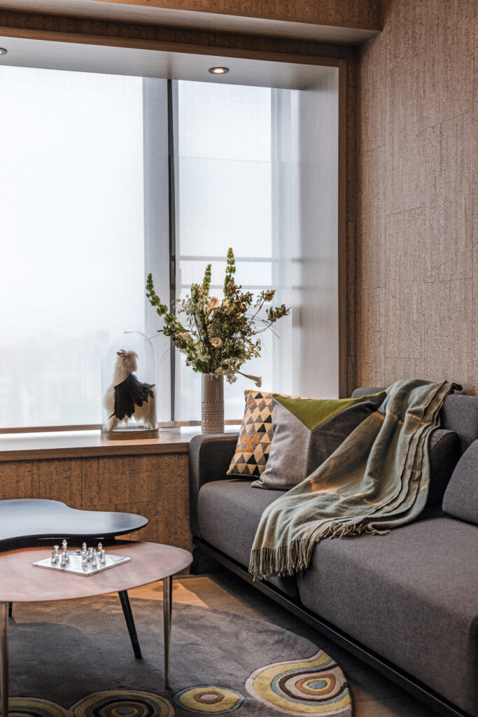
Seeking a theme that would provide a sense of unity across the whole space, the design team settled on the circle, seeing it as both a universal symbol of completeness and as an icon that’s synonymous with perfection for many mainlanders. With their base conceit in place, they then looked to incorporate it across the home in a series of knowing and simpatico variations – linked, multiple circles in the shared spaces, rounded cornering throughout and, where possible, the creation of curved enclaves. The circle motif was also embedded into the lighting installations, the carpeting and the occasional tables.
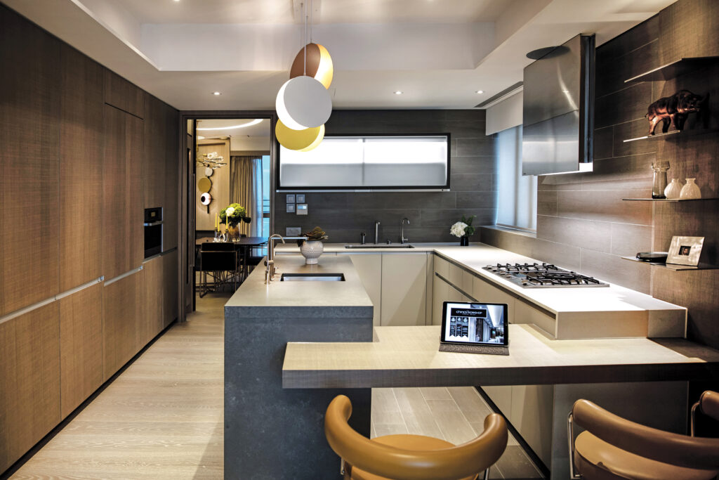
One of the first casualties of the circle-centred makeover was a long, straight corridor that led off from the dining area. Clearly out of keeping with the overall redoubtably round look, it was swiftly demolished, granting the kitchen area a curvaceous, open and welcoming appeal.
The bedrooms, too, were areas where Chinc’s set out to make its mark. Its most drastic move was to combine two of the rooms into an outsized master bedroom, one with abundant natural light, a commodious walk-in wardrobe and the last word in chic ensuite bathrooms.
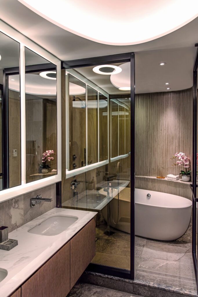
The focus on optimising the level of natural light in the bedroom space is another hallmark of Chinc’s approach. Explaining this particular element of the company’s design philosophy, Leung said: “No apartment, no matter how beautifully decorated, can look its best if the lighting is not right. By removing unnecessary walls and introducing pocket sliding doors and glass partitions, we subsequently maximised the use of natural sunlight.
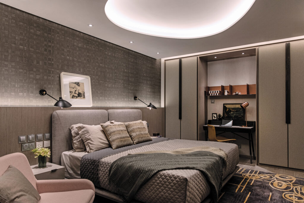
“We also employed asymmetric ceiling light housings to provide a diffused lighting effect overall in many of the rooms. We also opted to install down-lights in specific areas, all designed to create a dramatic look and feel as the night rolls in.”
While the tactical use of illumination has clearly boosted the home’s individuality, it is the sophisticated – yet playful – use of materials and upholstery that has gifted it the warmth the family was looking for. Whether it’s the wallpaper that morphs under various light sources, the individually-curated collection of custom ceramic tiles or the singularly-shaped selection of somewhat avant garde lounge chairs, an endearingly quirky and individualistic style prevails throughout the whole apartment.
While winning a pan-Asian award for the quality of its interior design work is clearly all to the good for Chinc’s Workshop and its future new business prospects, the real winner here is clearly the family. Given the studied elegance of their abode, coupled with its innovative and thoughtful use of space, light and design, how could any family not thrive in so accommodating a locale?
Images: Chinc’s Workshop


